Colors do more than just decorate—they have this powerful ability to communicate anything. Whether you’re painting a room, picking an outfit, or designing a logo, understanding color psychology can help you make intentional, impactful choices. Each color carries its own emotional weight and cultural significance, and when used wisely, it can evoke feelings, tell a story, or inspire action. Let’s explore 15 powerful ways to use color psychology to make a bold statement, no matter where or how you apply it.
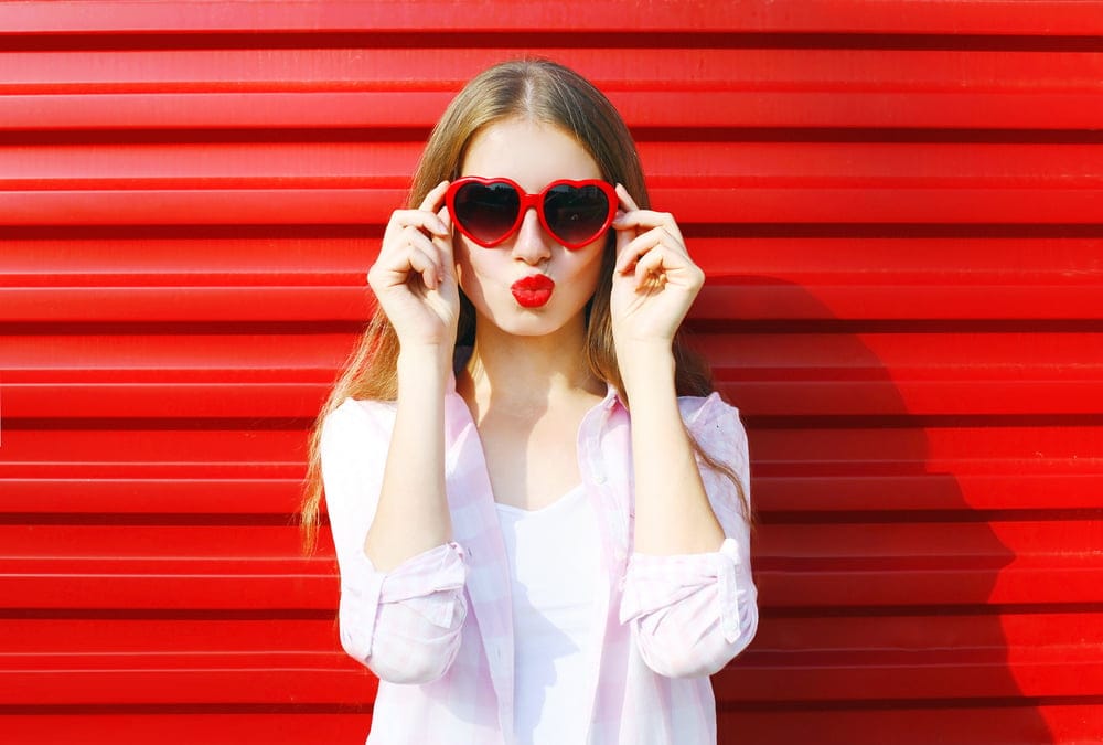
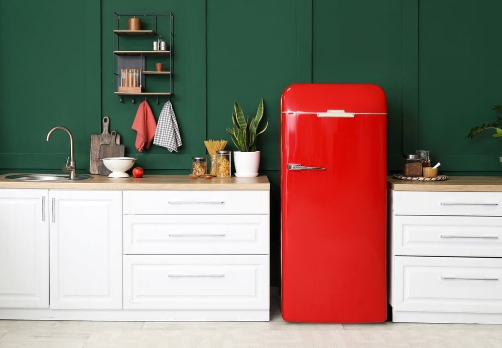
1. Command Attention With Red
If you want to grab someone’s focus immediately, red is your go-to color. It’s bold, passionate, and impossible to ignore. Whether it’s a red dress, a bright accent wall, or a logo with a splash of crimson, this color demands to be noticed. According to Verywell Mind, red is a color that stimulates emotions and captures attention instantly. It’s often associated with energy, urgency, and passion, which is why it’s commonly used in marketing, branding, and even emergency signage
But red isn’t just for drama—it can also inspire warmth and excitement. It’s a color of strong emotions, whether it’s love, anger, or ambition. In interior design, a red accent wall can energize a living room or dining area, encouraging lively conversations and interactions. In fashion, it’s the ultimate confidence booster, helping you make a memorable entrance. However, moderation is key. Too much red in a space or outfit can feel overwhelming or aggressive. To strike the perfect balance, pair it with neutral tones or use it strategically in smaller doses. When done right, red doesn’t just make a statement—it leaves a lasting impression.
2. Inspire Calm And Trust With Blue
Blue is the ultimate color of serenity and reliability. It’s why so many corporate logos, medical offices, and social media platforms use shades of blue to foster trust and professionalism. Highlighted by Psychology Today, blue is known for its calming effects and ability to evoke feelings of trust and stability. It’s a popular choice in corporate logos and home design, particularly in spaces like bedrooms, where relaxation is key
Deep navy conveys authority and competence, while lighter blues evoke freshness and openness. Blue’s versatility allows it to be both dynamic and soothing. For example, incorporating blue into a home office can promote focus and clarity, while a soft blue living room encourages relaxation. However, balance is important. Too much blue can feel cold or detached, which isn’t always the vibe you’re going for. Pairing blue with warm hues like orange or yellow can create a balanced and inviting atmosphere. Whether in interior design, branding, or fashion, blue sends a message of stability and peace.
3. Invoke Optimism And Energy With Yellow
Few colors are as cheerful and uplifting as yellow. It’s the color of sunshine, happiness, and creativity, making it a perfect choice for energizing spaces like kitchens or creative workspaces. As noted by The Spruce, yellow radiates warmth and positivity, making it a perfect choice for energizing spaces like kitchens or creative workspaces. However, moderation is important to avoid overwhelming the senses.
However, yellow is a tricky color. While it’s great for catching the eye, too much can feel overwhelming or even anxiety-inducing. A vibrant yellow wall in a small room might feel overpowering, but a few yellow cushions or a vase can add just the right amount of warmth and energy. In branding, yellow often evokes feelings of cheerfulness and approachability, making it a popular choice for companies looking to connect with customers in a friendly way. When used wisely, yellow radiates warmth and positivity like no other color.
4. Bring Balance And Growth With Green
Green is the color of nature, growth, and renewal. It has a calming yet invigorating presence, making it perfect for creating a balanced and harmonious environment. Whether it’s leafy houseplants, emerald accents, or sage walls, green adds a touch of freshness and vitality to any space. It’s the ultimate grounding color, connecting us to the earth and promoting a sense of stability.
It’s also associated with wealth and stability, which is why it’s a favorite in financial branding. If you want to channel feelings of prosperity and abundance, green is your ally. In home decor, shades like olive and forest green can create a cozy, sophisticated look, while lighter greens feel refreshing and airy. Incorporating green into your wardrobe, such as a jade scarf or emerald jewelry, can add a pop of elegance and vibrancy. Plus, with so many shades to choose from, there’s a green for every mood—from the earthy and grounding to the vibrant and energizing.
5. Embody Energy And Enthusiasm With Orange
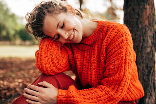
Orange combines the boldness of red with the cheerfulness of yellow, making it a color that exudes energy, creativity, and enthusiasm. It’s often used to grab attention without feeling as intense as red. Highlighted by Color Psychology, orange combines the energy of red and the warmth of yellow, making it an excellent choice for conveying enthusiasm and creativity. It’s often used in branding to evoke friendliness and excitement.
Orange is perfect for creating a lively and inviting atmosphere, especially in social spaces like dining rooms or event venues. It’s also a favorite for brands that want to convey friendliness and fun, like children’s toys or sportswear companies. Just be cautious—like its fiery counterpart, too much orange can be overstimulating. Use it strategically to spark excitement and creativity without overwhelming the senses. Whether it’s a burnt orange throw blanket or a tangerine tie, this color packs a punch while keeping things vibrant and approachable.
6. Exdude Sophistication And Timelessness With Neutrals

Neutrals like black, white, gray, and beige might seem understated, but they’re power players in color psychology. These tones are versatile, timeless, and perfect for creating a clean, polished look. Black conveys elegance and authority, while white symbolizes purity and simplicity. Gray offers balance, and beige brings warmth and subtlety. These hues work beautifully on their own or as a backdrop for bolder colors.
Neutrals often act as a canvas, allowing brighter colors to shine. An all-black outfit exudes sophistication and mystery, while a minimalist white room creates a sense of openness and calm. Beige tones are perfect for creating a cozy, inviting atmosphere in living spaces, while gray adds a modern, industrial touch. When you want to keep things sophisticated and classic, neutral tones are the way to go. Their versatility ensures they’ll never go out of style, making them a safe yet impactful choice for any application.
7. Channel Luxury And Creativity With Purple
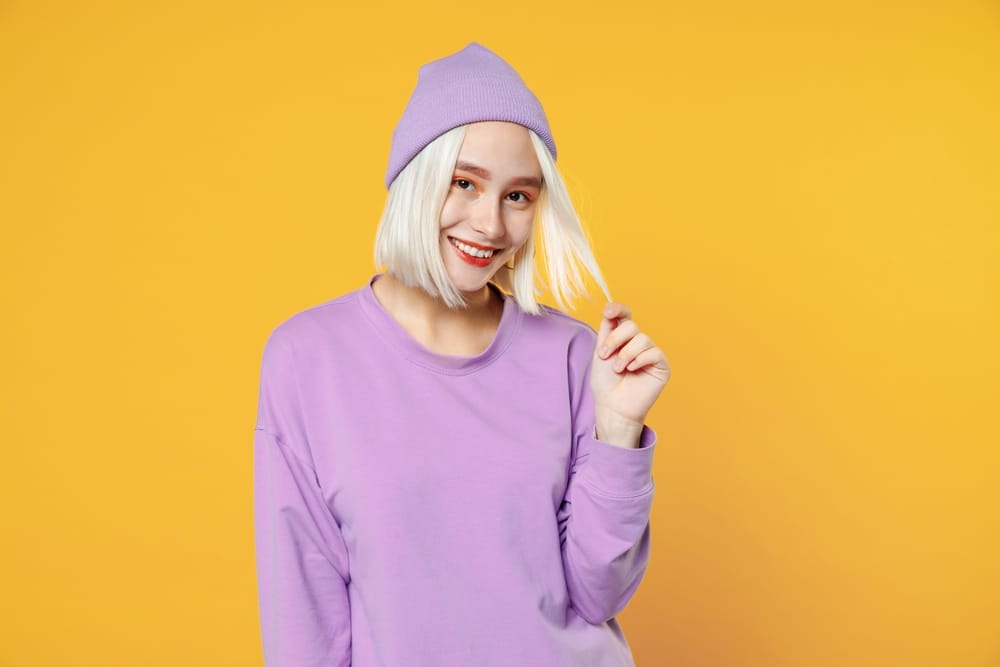
Purple has long been associated with royalty, luxury, and creativity. Its deep, rich tones exude elegance and sophistication, making it a go-to color for anyone looking to make a bold statement. Whether in branding or interior design, purple conveys a sense of uniqueness and grandeur that can’t be ignored.
Light shades like lavender bring calmness and a touch of romance, while darker hues like plum feel dramatic and opulent. Incorporating purple into your space or wardrobe can instantly elevate its appeal, adding a layer of depth and creativity. It’s a color that speaks of individuality and bold choices, making it perfect for those who want to stand out in style.
8. Inspire A Fresh Start And Simplicity With White

White is the ultimate symbol of cleanliness, simplicity, and new beginnings. It’s often associated with purity and clarity, which is why it’s a favorite in minimalist design, wedding themes, and healthcare branding. White creates a sense of openness and space, making it a popular choice for small rooms or areas where you want a clean, uncluttered look.
Incorporating white into your home, wardrobe, or designs can evoke feelings of peace and simplicity. A white button-down shirt exudes timeless elegance, while a crisp white room feels serene and rejuvenating. However, too much white can feel sterile or cold, so it’s important to balance it with textures, patterns, or pops of color. White represents a blank slate, a fresh start, and endless possibilities, making it a versatile and impactful choice when used thoughtfully.
9. Step Into Your Power With Black
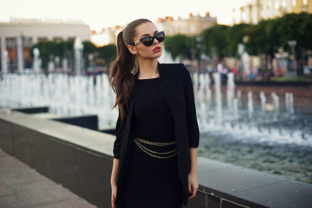
Black is the ultimate power color, exuding authority, mystery, and sophistication. It’s a go-to for making bold statements in fashion, interior design, and branding. Whether it’s a little black dress, a sleek black car, or a dramatic accent wall, black communicates confidence and elegance like no other color. It’s also timeless and versatile, pairing effortlessly with any other shade.
However, black can also feel heavy or overwhelming if overused. In design, it works best as an accent or grounding color, adding depth and contrast to a palette. In fashion, it’s the epitome of chic, perfect for both formal and casual settings. Black symbolizes strength and refinement, making it a powerful choice for those who want to leave a lasting impression. Just remember to balance it with lighter tones to keep it feeling approachable.
10. Inspire Compassion And Playfulness With Pink
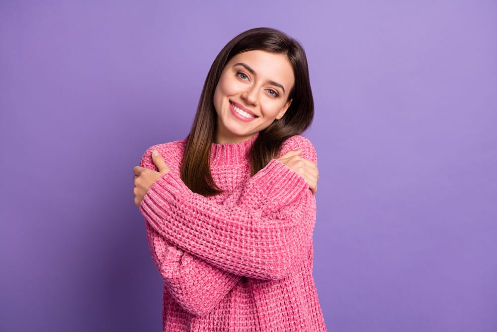
Pink is often associated with love, kindness, and femininity, but it’s so much more than that. It’s a versatile color that can range from soft and romantic to bold and edgy. Light pink tones, like blush or pastel pink, evoke feelings of compassion and warmth, while vibrant shades like magenta or hot pink add energy and playfulness.
In fashion, pink can make a bold statement, whether it’s a pastel blazer for a touch of elegance or a neon pink accessory for a pop of fun. In interior design, pink is great for adding a sense of charm and whimsy to a room, especially when paired with complementary colors like gold or navy. Pink’s ability to balance softness with vibrancy makes it a powerful tool in color psychology, perfect for conveying a message of positivity and creativity.
11. Exude Success And Prestige With Gold
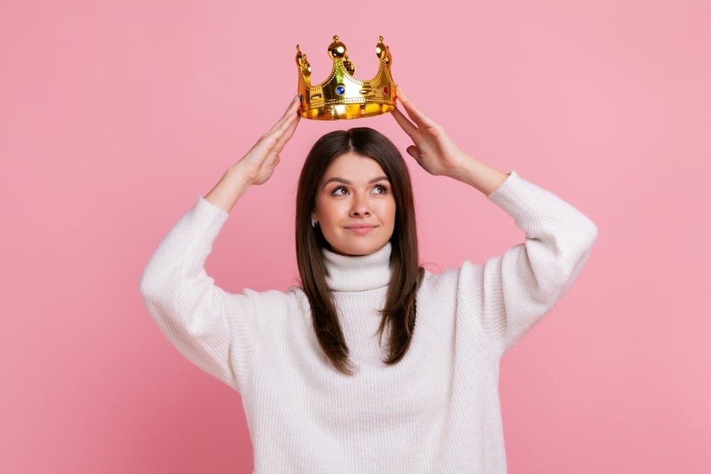
Gold is the ultimate symbol of luxury, success, and achievement. It’s a color that catches the eye and instantly elevates the look and feel of any space or design. Gold accents in interior design, such as picture frames, light fixtures, or decorative pieces, add a touch of opulence and warmth. In fashion, gold jewelry or accessories exude elegance and sophistication.
Gold is also a favorite in branding, often used by companies that want to convey prestige and quality. However, too much gold can feel gaudy, so it’s best used sparingly as an accent color. Pairing gold with neutral tones like black, white, or gray can enhance its luxurious appeal without overwhelming the senses. When used thoughtfully, gold communicates success, abundance, and confidence, making it an excellent choice for creating a statement.
12. Comfort And Ground With Brown

Brown is a grounding, earthy color that evokes feelings of stability, comfort, and reliability. It’s a favorite in rustic and natural design styles, often seen in wooden furniture, leather accents, and organic materials. Brown creates a sense of warmth and security, making it perfect for spaces where you want to feel cozy and at ease.
In fashion, brown tones like camel or chocolate add a timeless, understated elegance to any outfit. Brown is also a great choice for branding in industries like coffee, agriculture, or outdoor gear, where it conveys a connection to nature and authenticity. While it might not be as flashy as other colors, brown’s understated appeal makes it a dependable choice for creating a grounded and welcoming atmosphere.
13. Restore Balance And Harmony With Gray

Gray is the epitome of balance, sitting comfortably between black and white. It’s a neutral tone that conveys sophistication, calmness, and modernity. Gray is incredibly versatile, making it a popular choice in everything from minimalist interiors to sleek corporate branding. It’s a color that lets other shades shine, acting as a subtle backdrop for bolder accents.
In home decor, gray walls or furniture create a sense of tranquility and refinement, while in fashion, a gray suit or dress exudes professionalism and elegance. However, too much gray can feel cold or uninspiring, so it’s important to pair it with warmer tones or textures. Gray’s adaptability makes it a staple in color psychology, perfect for creating a polished and balanced look in any setting.
14. Invite Innovation With Silver
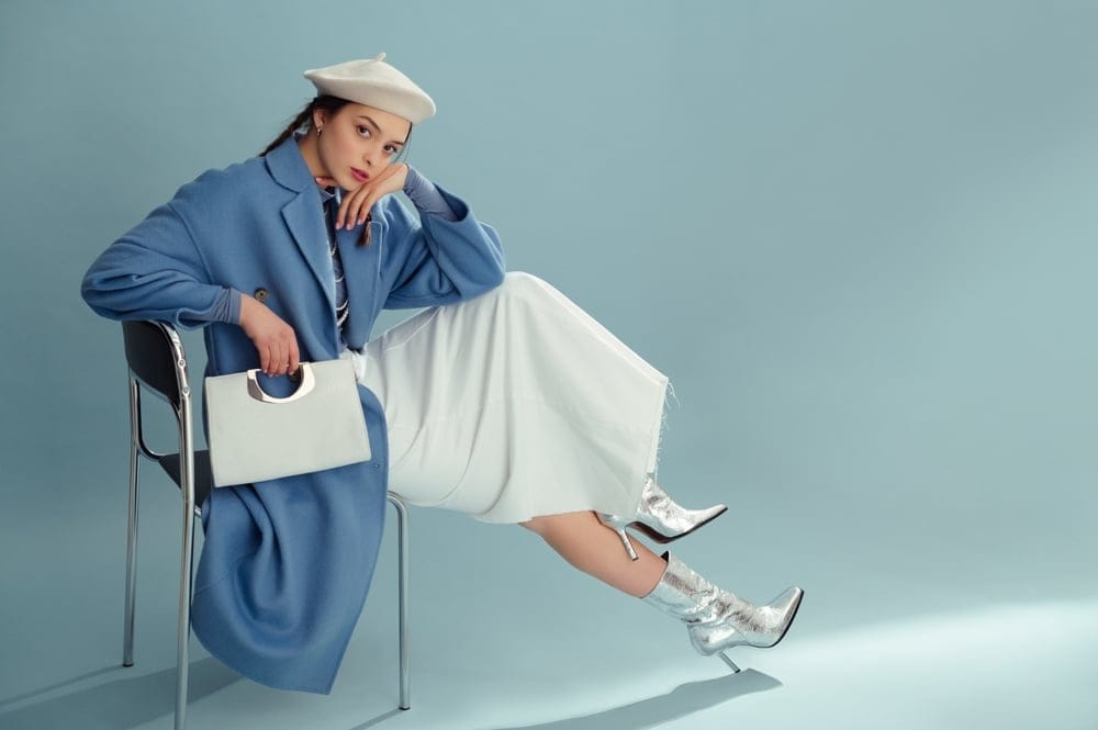
Silver is a sleek, modern color that symbolizes innovation, technology, and elegance. It’s often associated with high-tech industries and futuristic designs, making it a favorite in everything from electronics to luxury branding. Silver has a cool, metallic sheen that adds a sense of sophistication and modernity to any space or outfit.
In interior design, silver accents like mirrors, metallic finishes, or decorative pieces add a touch of glamour and brightness. In fashion, silver accessories or fabrics make a bold, futuristic statement. Silver is also a great choice for brands looking to convey a cutting-edge, forward-thinking image. Its sleek and versatile nature makes it a powerful tool for creating a statement that feels both contemporary and timeless.
15. Unleash Creativity And Fun With Multi-Color
Why choose one color when you can have them all? Multicolor designs are vibrant, dynamic, and full of energy. They’re perfect for conveying creativity, inclusivity, and playfulness, making them a favorite in industries like entertainment, education, and children’s products. A rainbow palette instantly catches the eye and leaves a lasting impression.
In home decor, multicolor accents like rugs, artwork, or throw pillows add a lively, eclectic vibe to any space. In fashion, a multicolor outfit or accessory exudes confidence and individuality. Multicolor branding is perfect for companies that want to appear approachable, innovative, and full of life. While bold and playful, multicolor schemes can be challenging to balance. Pairing them with neutral tones or using them in small doses ensures they feel cohesive rather than chaotic. When done right, multicolor designs celebrate diversity and creativity, making a bold and unforgettable statement.
This content was created by a real person with the assistance of AI.